
~ ~ ~ ~
~ ~ ~ ~
~ ~ ~ ~

the first day of spring will not be here for another week. but my older sister's birthday is that day, and so i will probably be doing a birthday post for her on that day. although we may still get more snow before it's over with for the year, i'm ready to lose the purple scarf in my blog header and embrace spring!
{i think i will bring back the scarf again when fall comes back around, because this was one of my favorite banners... it had the feel i most wanted to achieve of all my banners so far.}
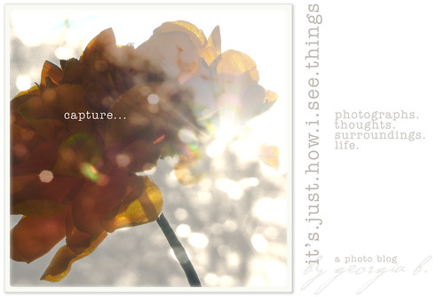
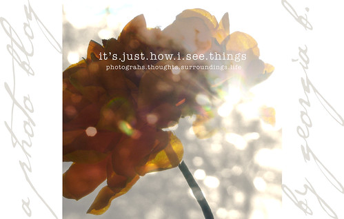
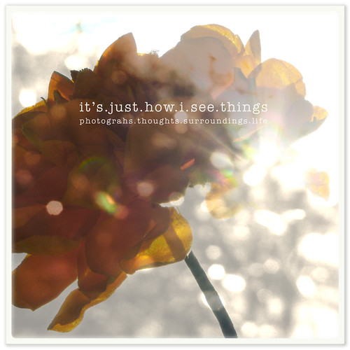
anyway, i've always picked a photo and started playing with a new banner until i got to something i like. but this time, i played around with four similar, but different layouts. i thought i'd be able to choose one and go with it... then just put it out there live and let you all be surprised with something new for spring. but since i can't decide, i thought i'd let you guys give me your two cents. your critique. your vote.
so which one will it be? one, two, three or four? i have to say, i'm leaning toward number one and would probably pick it {if you told me i had to pick one if i ever wanted to have chocolate ice cream again }. but i really don't know which to choose. goodness... it's a good thing i don't have so many choices all the time in life. indecisiveness will really stifle you. *giggle*
actually, i just want to hear what all your creative minds would say. and it's not that i will necessarily go with the one that has the most votes. but i will definitely take in your feedback.
when i used to work as a designer/production artist at a book publisher, i had the privilege of designing two book covers and three pamphlets. that design process worked similarly. we were to come up with three design comps for each cover and those would be presented to a group of decision-makers who would pick the best concept. then, we would have to take the one they chose and keep tweaking/perfecting it until it was final.
so you guys are my panel this time. this is the part where you tell me your vote and critique. YAY! {go ahead... i can take it. oh, and if you need to see any of them larger and one-per-page to help visualize, you can click on the photo.}
{hope you are enjoying this weekend! sounds like today has been warm and sunny in a lot of other places. we had chilly rain, but tomorrow's light will linger longer, and spring will follow suit. waiting for the kindness of light and warmth like never before...}
14 comments:
Nice work with the textures!! And colors. Orange is rapidly becoming one of my favorite colors:) I like the 2nd from the top -- couldn't say why that one over the others . . . maybe the pretty script on either side of the photo, the balance.
Hmm . . . though when I give it another looksie, I also really like the first one! Tough decision!
... keep changing my mind ... no. 2 was my first thought now i think no.4 as it is the cleanest. Happy Spring and Happy weekend xx
#4. I like the cleanness. :)
Short & sweet, huh?
xo
Debi
I like the second version also. I was never partial to the word capture in regards to photography...too aggressive for me.
They are all beautiful, but #2 is my fav :)
I like 2, because it's the only one that puts your name in the banner.
wellllll .... oh my gosh, you make this tricky!
first off, i love the tones you have here ... your image is so cool ... and while i really like the font in the second one ... eeep, i think i tend to like #3 ... all contained and pulls me right into 'how you see things' ...
thanks for letting me spout my two cents!
i took a peek at all your former banners ... so diverse and beautiful ... love the peony ... love the birds ... each one wonderfully expressive ...
pg xo
i like one or two. but i'd put jorjah b in a darker font (maybe the color of the stem?) because it's really difficult to see, especially in number one.
looking forward to the new spring banner.
your purple scarf banner is my favorite, too.
Your flower looks as though it's encrusted in jewels, so pretty. Interesting what Steve said about the word, "capture." I never thought of it as aggressive...I just thought of it as being fortunate or skilled enough to be able to grab a certain shot...but I do see his point now. I wonder what #1 would look like with no words on the flower? But I vote for #1, too...I think...
okay, i know you don't know me, but i'll give you my choice anyway...the first one for sure. at first i couldn't decide either, but the more i looked all them all i kept going back to the first. the word "capture" so suits that photo, and i like the side text better in the first one than in the last one. :-)
I like the one you are using today ...
thanks, guys.
ang, i kinda wanted my name to be lighter, but i'll try your suggesstion.
s., i'll bring back my last banner again. :)
i took this all into account, so thanks!
ooooo i love the options you've created... i am a little too late to put in any input, but i think i'd agree with the one your chose as being my favorite (but it is a hard choice, considering they all rock!!) love them!! i never change the banner on my blog of seth and i because i love the love i captured in that photo... but looking at all the fun banners you make, it makes me start to consider making a change ... hmm... maybe in a week when i have a break from work, i'll play around with it!
i love your banner, too, alicia. i know what you mean about wanting to change it, but i can completely see why you would not want to, as well. it is so perfect and fitting for your blog! one of the best, sweetest pictures i've ever seen used.
Post a Comment