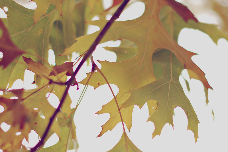
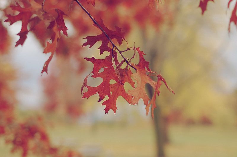
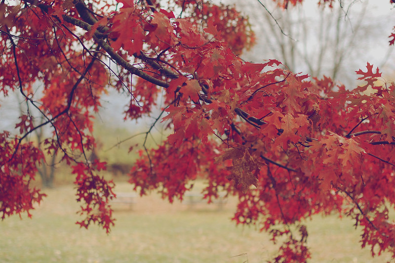
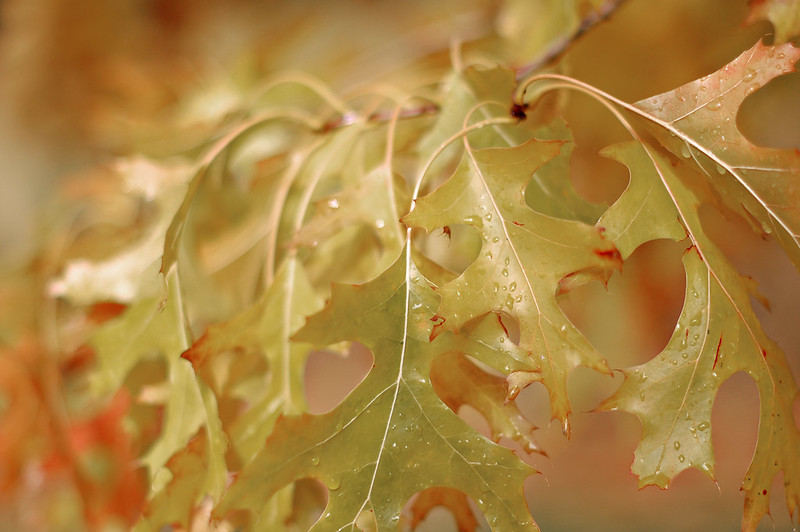
today is our twelve-year wedding anniversary. so i thought i'd post part one of the photos from our yesterday celebration. and i couldn't think of a better image to start with from our time out in nature than this image of two leaves entwined like two hands.
i like to think mr. b. and i are entwined... and now there's a new miniature leaf in the mix with us, too... a colorful blend of two larger leaves.
we've made it an anniversary tradition each year to first go to our favorite coffee shop, and then venture out to a bog in our area that has become our favorite nature spot. it is truly beautiful. every year, i'm more amazed than the last at just how pretty this place is, compared to all other nature preserves around here. we almost feel transported away, from what we feel is typical in this part of the midwest, to a magical and enchanted land... it's that pretty.
but enough using words to describe this place. i'm gonna post my photos from the day instead.
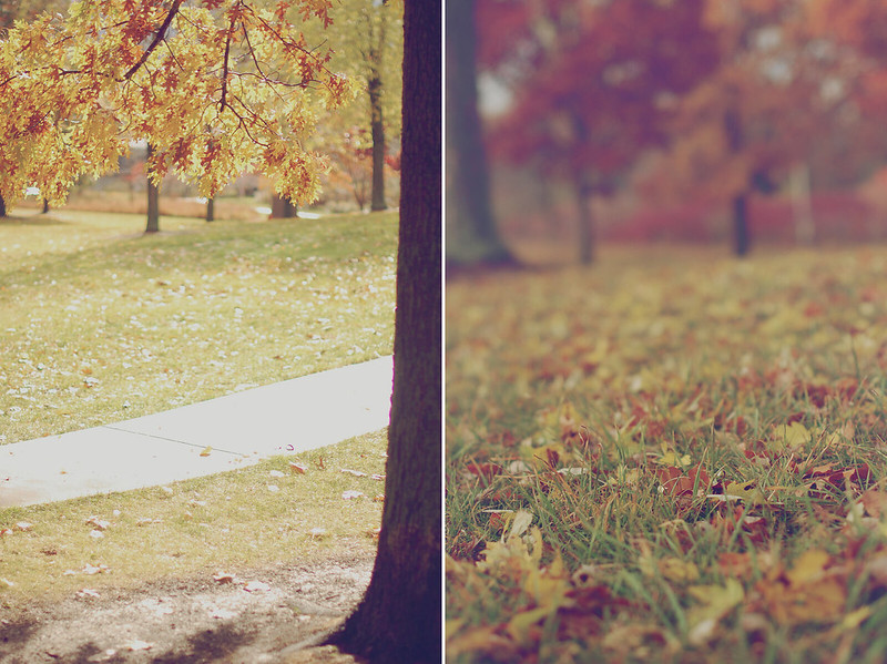
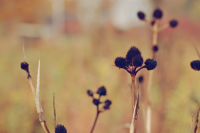
with one last preface to the photos, though... like i said, this is just part one. i'm posting the shots i took in two separate posts, because i have found that when i take autumn photos, they often seem much too saturated... even if i try to adjust the images in photoshop. they never seem really true to life the way i saw the scene with my eyes. {maybe because i don't have the settings on my camera adjusted properly??} so after recently tweaking a new free photoshop action that i found online to give me this muted/unsaturated look that i love, i found that it lends itself well to these fall shots by keeping the richness of them, but reducing that less-than-desirable saturation. {i know it's a look that's not for everyone, but i like it. i was playing around with it to use in the editing of some engagement shoot images a little while back, and really came to like what i came up with. i'm curious what you think of the look.}
anyway, the rest of my photos didn't really need that adjustment because i liked them closer to what they were straight-out-of-camera. and i didn't think both looks would go well together in one post.
so here is subdued, muted part one. sharper, brighter part two will come next.
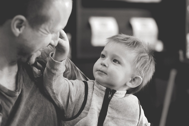
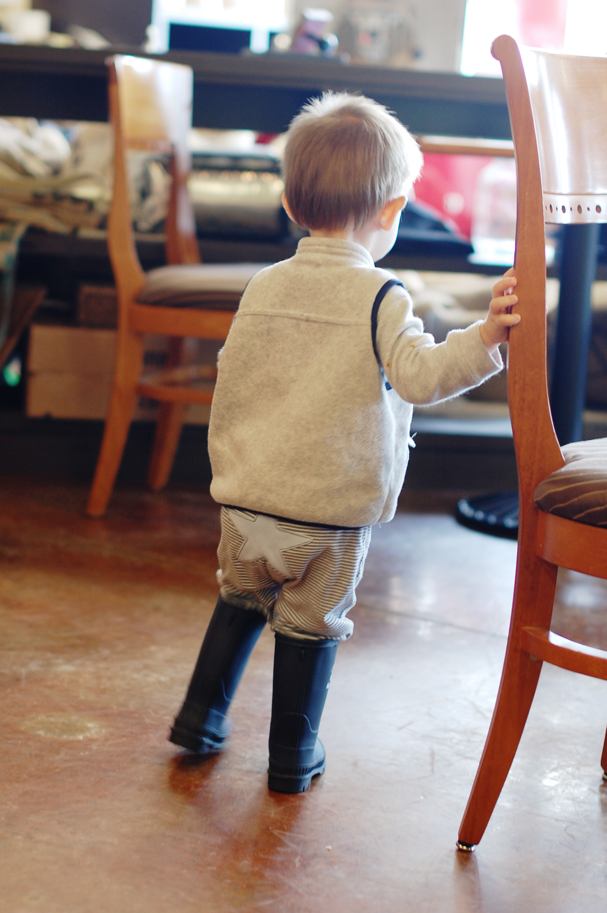
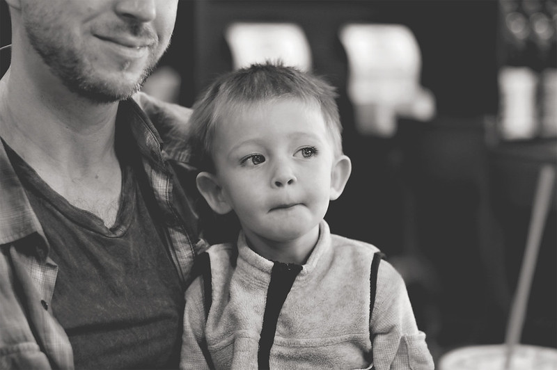
...from coffee shop to bog...
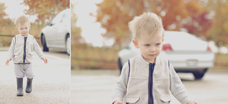


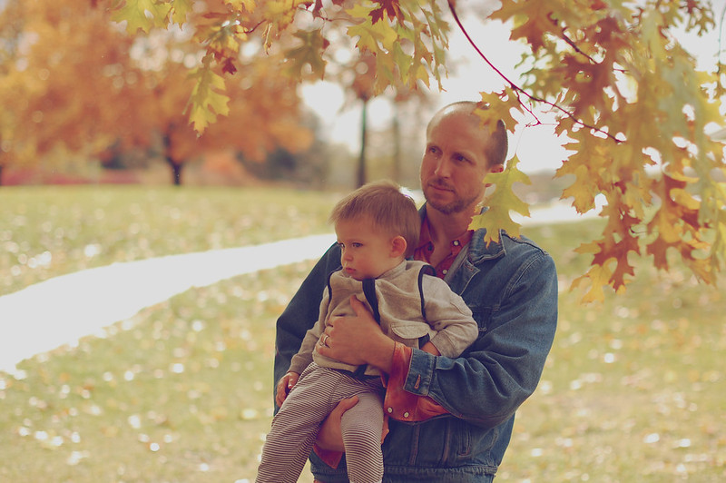
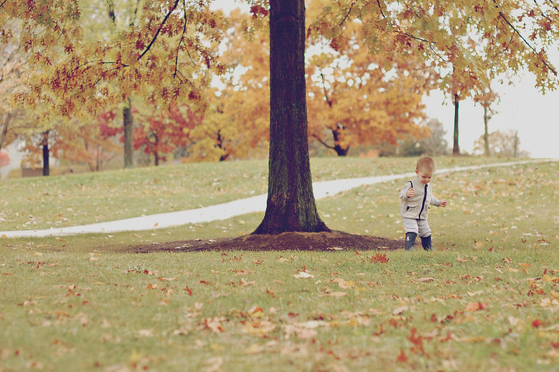
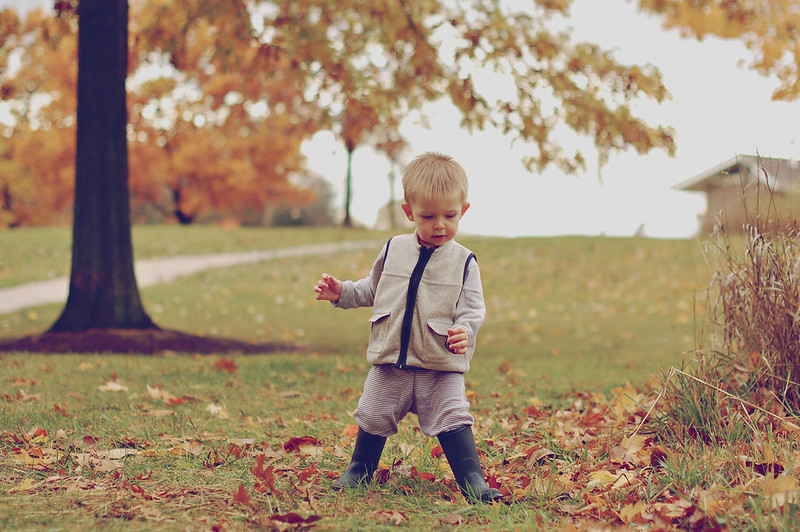

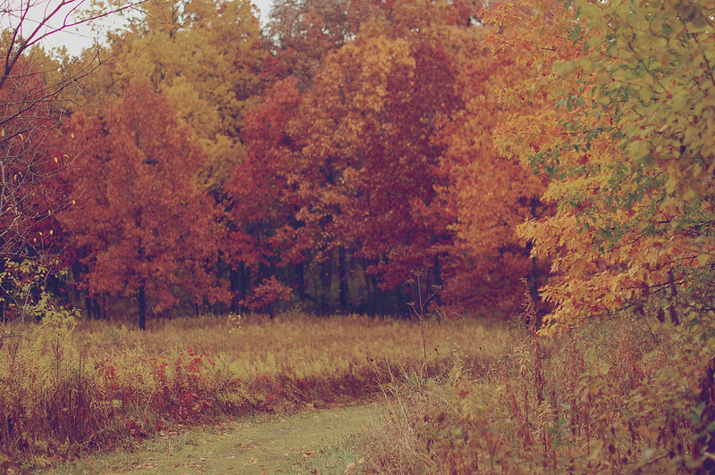

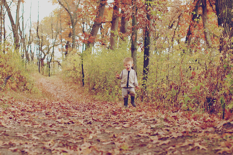
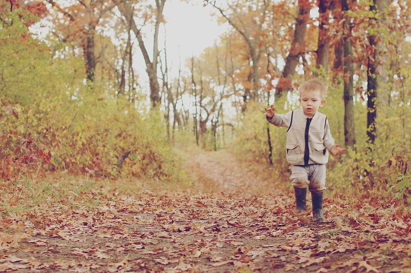
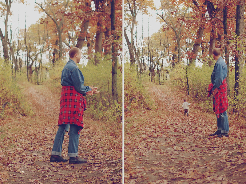
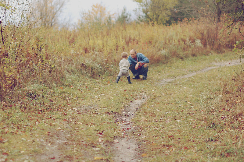
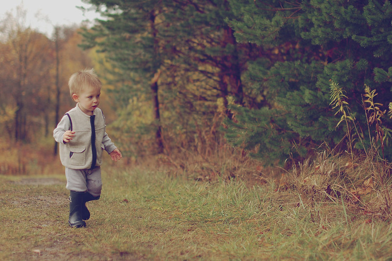
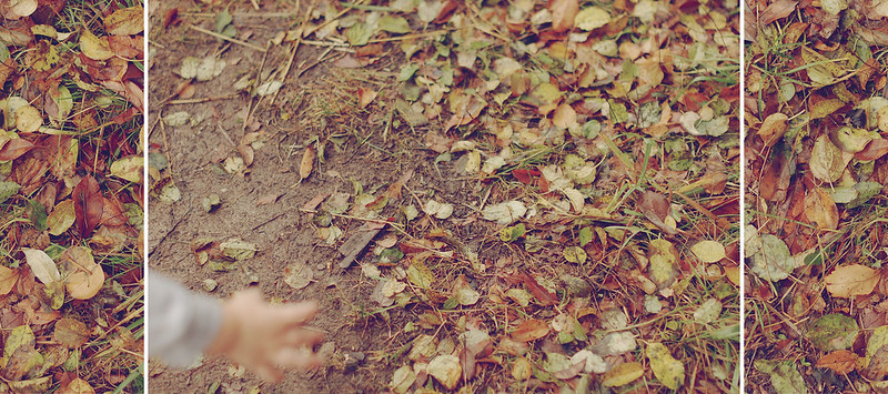
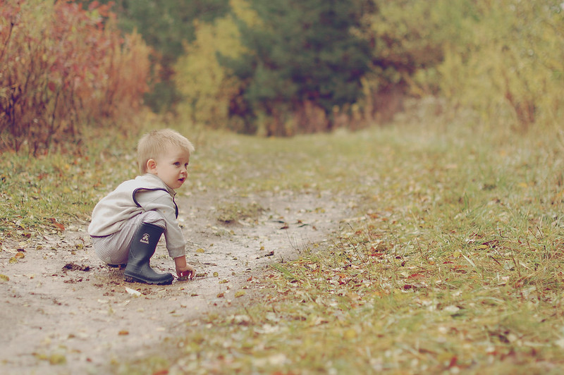
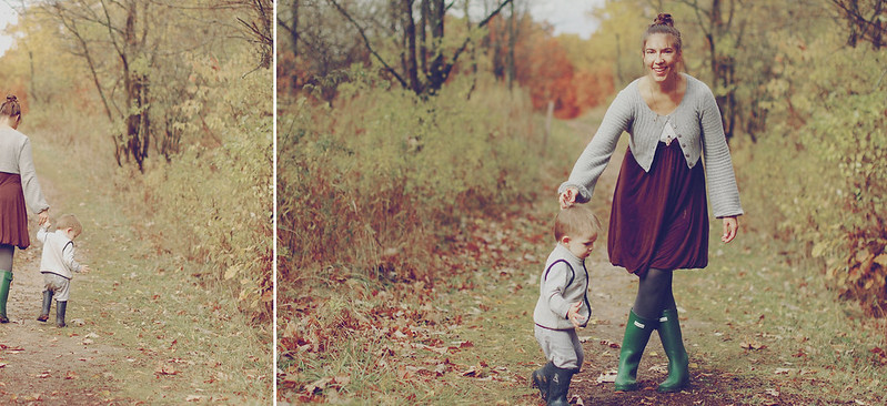
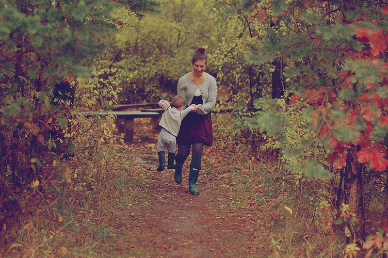
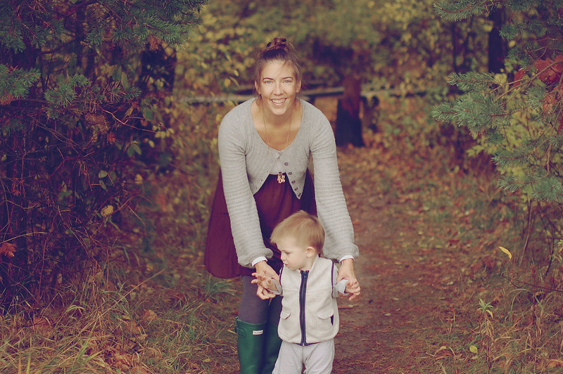

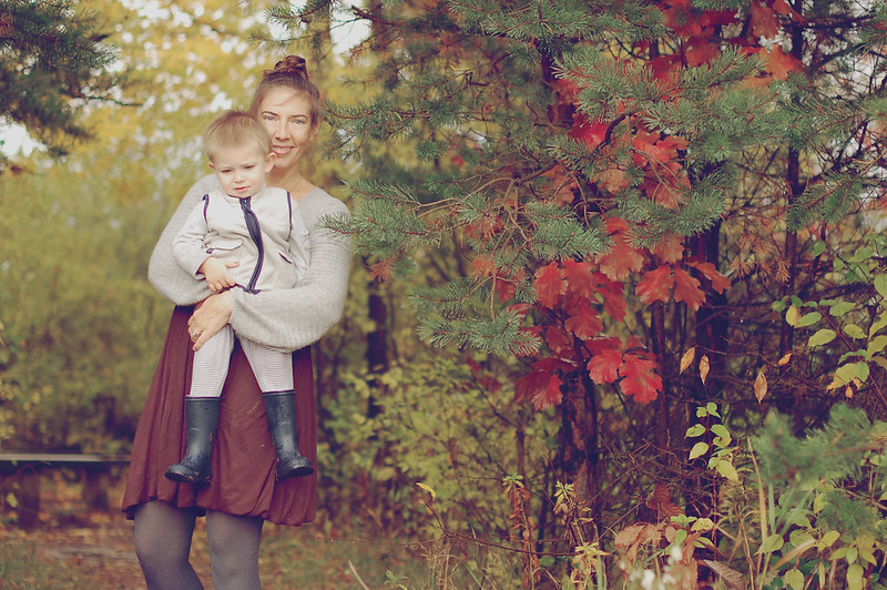
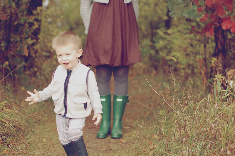
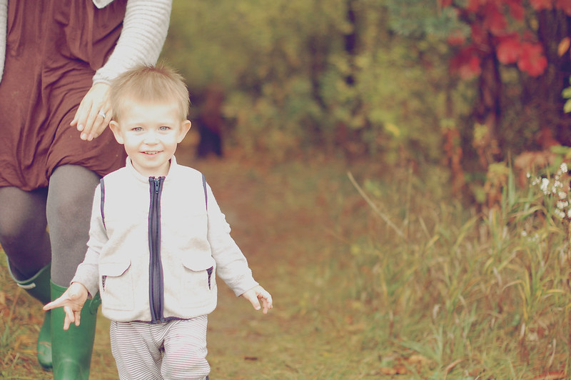
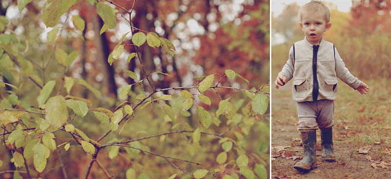


there's so much more i could write about in regards to our time there... but i'll leave that for part two. suffice it to say that isaac was enchanted by rain puddles and is quite taken with mud {forever a fan} ,which you may have begun to guess after seeing some of these photos.

4 comments:
absolutely stunning photos! What a beautiful family!
thank you so much, momma to joa!!
beautiful muted tones in these, Georgia! such pretty fall colors you have back there. Fun to see little Issac enjoying the mud. :-)
thank you... glad you like. i'm not sure that everyone likes this style.
Post a Comment