
i've been so intrigued by {and smitten with} some of the work of an artist i recently discovered... santiago vasquez. so much so, it had me searching through my recent photos to see if i could use any to create something along the lines of what he's been doing with his photos.
if you've visited here before, you may have seen some of my "double exposure" posts, and you'll know my playing with that isn't anything new for me. but the part i have not really played around with {at least not that i can remember} is the repetition. i've seen a lot of photographers who seek out repetition in their subjects and photograph it as it is. but i love the way artists like vasquez take a photo {one that bears no repetition within the image} and repeats the photo itself. i wanted to incorporate both the overlapping and the repetition in these.
in the case of vasquez's work, his repetition produces some interesting imagery... i think so, anyway. i've been quite fascinated with triptychs in photography and film lately {something else i've been playing with and will post soon}, so his work really caught my eye. especially this piece and this piece.
anyway, my images today are the product of his inspiration!
as i played around with these, i noticed that several of my end results were turning out to look like insects or butterfly-esque things with wings... thus the "wings & things" title i put on my image {which you can see the original of here}.
.
.
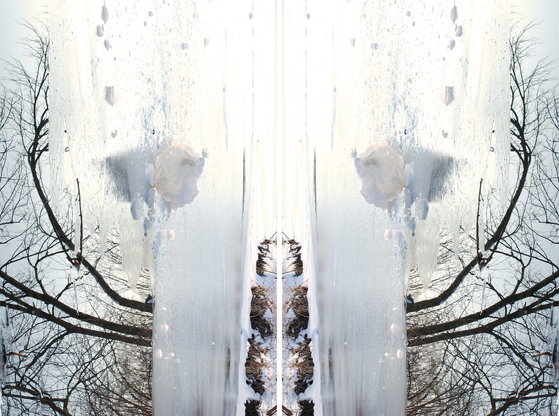


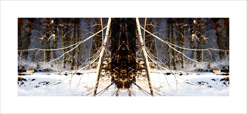
{i love the way the image above looks on a black background. it's like a giant science fiction insect getting ready to prey on the forest!
same for the image two above that one... you can see it larger on a black background as well, here.}
.same for the image two above that one... you can see it larger on a black background as well, here.}


.
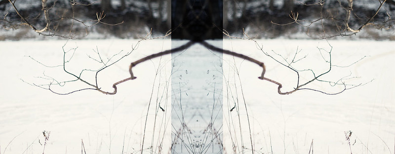
i don't know... i just thought that with the interesting lines in the trees and foliage, these repetitive, mirrored and/or overlapping panels made these photos doubly interesting... or at least more so than when they were just single photos.
i don't know... i just thought that with the interesting lines in the trees and foliage, these repetitive, mirrored and/or overlapping panels made these photos doubly interesting... or at least more so than when they were just single photos.
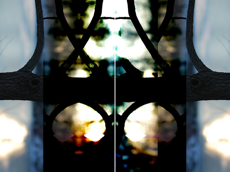
here is one where i turned it on its side, then played around with overlapping layers as well as different photoshop layer modes...
.
.
.
i did like the original photo for this one. but i was kind of crazy abot the colors, textures and shapes happening in the center after i started overlapping this photo onto itself. it's a lot different than most of the others, but i wanted to include it, as it's one of my favorites. it reminds me of stained glass.
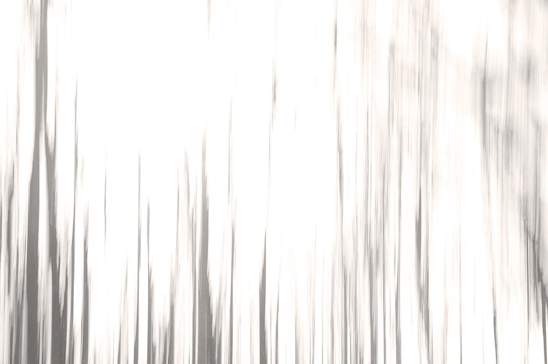
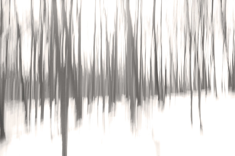
below are some more results of my playing. but instead of playing in post-production, i the playing as i took the pictures... from that same photowalk shoot at morton arboretum from a few weeks ago.
.
.


.
had it not been for this santiago vasquez piece, i'd have forgotten about these tree shots that i had every intention of posting at some point. on these, i moved my camera up and down as i took pictures of the woods to get this effect of movement. they actually look like paintings more than photos. but i still loved how they came out.
whether during or after, it's fun to play around with photos sometimes. i don't really consider myself an artist... not in the vasquez sense, anyway. but i do like to play and let my creativity run free sometimes.
wanting isaac to explore his creative and artistic side, i have to remind myself to do the same. everyone has to color outside the lines at least a little from time to time, don't you think?
anyway, with that, here's one last image...
.
wanting isaac to explore his creative and artistic side, i have to remind myself to do the same. everyone has to color outside the lines at least a little from time to time, don't you think?
anyway, with that, here's one last image...
.

.
i simply took my favorite photo from that day and sliced it up. then i flipped some of the slices and repeated them.
this being the last full day of winter, i figured i'd pay homage and respect to the season with these snowy pics before it's over... in hopes that it won't be cruel and linger too much longer. overlapping photos are okay. overlapping seasons... not so much. =)

15 comments:
Fascinated by this and wondering how you did it.
would love to share, susan!! i'll write up a tutorial and share on my blog... hopefully soon.
p.s. thanks for looking!!... and for commenting. .=)
These are so great, G. I think my favorite is that first one.
Hi Georgia...I think you found your niche. These are stunning and fascinating. Please post more.
thank you so much, liza! i do plan to do much more of this. it's fun to play... takes photography into a new level of art, and i love that!!
ok, so I took a closer look at these images and read the post carefully. I was moved the first time to write something quickly. You need to take yourself a little more seriously as an artist. These are stunning! Bravo!
thanks, stacey. didn't see your comment until after i published liza. =)
i think the first is also my favorite... perhaps why i chose to place it first. it reminds me of a butterfly.
These are really beautiful. Great job!
awww... thanks, sweet leanne!
Oh G. These are amazing! I love them so much! I've seen some of this kind of stuff floating around the internet and I am inspired by your guts to go and try it for yourself! Puts a fire under my rear end about going beyond the basic in Photoshop. I'm so tied to LR that I barely get in to CS5 these days. Anyway, LOVE these!
thanks, T!!! it's fun. and it gets you through the photography lulls or blocks. and, it's just plain cool to do/learn/play. now, that said, if i could photograph like you, i'd likely never do this stuff. i'd just take beautiful pictures all the time like you do! =)
like i said, the originals are not nearly as exciting as the manipulated play images. if you had taken them, they would be!! thanks for stopping and peeking.
These are beautiful! Please do post more!
I think that last one is my favorite. Beautiful cool color.
thank you, andrea!! i will post more. i hope to do more soon. it seems like whenever i start something new like this, it fades away for a while. like my double exposures. i need to keep up with this one, 'cause it's been well-received!!
i, too, love the color in that last collage. it actually was quite different in the original photo... less dreamy. but i added a layer that enhanced the colors and lights and darks and made the blue lighter. glad you liked!!
Post a Comment